-
About us
-
Services
-
Template store
-
Extension Store
-
Sharing Corner
-
FAQS
-
Contact


")
")
Tuesday, 02 August 2016 00:00
Change your website's look by the breakthrough Responsive Web Design technology!
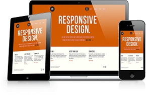
Responsive Web Design (RWD) has become one of the hottest trends in 2013 and popular used by professional website designers around the world. People nowadays seem to talk more about Search Engine Optimization (SEO) friendly website and the increase of web search via mobile devices and tablets rather than via desktops. RWD technology will strongly help your website to improve SEO. ExportHelp via this article, would like to bring Clients 7 main reasons for enhancing Responsive Web Design for your websites.
So, what is Responsive Webs Design (RWD)?
In a simple way of thinking, RWD means that the site adapts to whatever size screen it's being displayed on, no more partial-content mobile versions of sites. In addition, the website will be displayed in readable way; users do not need to zoom in, zoom out, turn left, and turn right to catch the whole content. It focuses on multi-platform usability that has also seen the design approach favorable for SEO.
Why we need to enhance Responsive Web Design for our websites?
1. Google will definitely prefer websites with Responsive technology!
 Google has suggested Responsive Design when optimizing a website for smartphones. For that reason, people working in SEO are ready to follow this design approach. Google

2. One website, one URL for all devices access
 Before Fully Responsive technology turns up, maintaining optimal user experience meant additional website versions were necessary for the content to translate well on mobile devices and tablets.
Creating a mobile version for an optimized website requires starting a SEO strategy from the beginning. The reason is mobile web version have different URL and HTML code. Therefore, Google will treat their page authority separately.
All the authority collected from the original website pages, will not be carried over to the mobile version. This is a disadvantage when considering backlinks and social shares – two important tools in SEO strategy. From now on, no matter what device a website is displayed on, Responsive Design automatically adjusts a page in a way that webmasters can retain their content on the same URL.
 Consequently, no separate optimization campaigns are needed to optimize for different devices. You can save a large part of time and money!

3. Responsive helps combat high bounce rate and then…we have happy users!
 Websites not translating well on different devices is one of the main reasons for users to leave. If a user leaves a website right after arriving, Google may take it as an indication that the content presented in that website is not the most relevant. The aim for Google is to guarantee that its visitors reach the answer of their search query on the first SERP, so a high bounce rate on a website, will ultimately lower its rankings on search engines.
A mobile website can have differing content from its original version, whether it be summarized or excluded altogether. In addition, discrepancy in pixel sizing along with high mobile data costs can make loading time, navigation and viewing problematic, which will also make users leave to find a website that is easier to navigate on their device.
Fully Responsive Design can solve these problems by presenting content in a functional way without compromising what device you choose to display on. The content will become easy to view which ultimately keep users on your page.

4. A considerable part of Google searches come from mobile devices
 The increasing amount of people searching on Google via mobile is a real trend that people working in SEO need to take into account when planning an optimization strategy if they desire to stay ahead.
Thanks to RWD and SEO, users that have positive experience on an optimized mobile website are prone to convert from the potential to the real customers.

5. Reduces link building
 As everything links back to just one URL, both mobile and desktop versions have the same link profile when set in Responsive Design. For SEO purposes, this approach is an advantage against competitors which choosing a separate mobile website and have to create their domain authority from scratch.

6. Avoids duplicate content
 Having a separate mobile website may bring a repercussion for SEO when both sites present identical content. Because duplicate content considered as a dishonest SEO trick to improve search result and generate traffic for the website, updated Google’s Panda illustrated the search engine seriously tackling the problem of duplicate and poor content.
 Thus, it deals a death-blow to many websites by significantly dropping their ranks or even completely kicking them out of search results. As a result, understand why duplicate content today might be a serious matter of concern for SEO.

7. Bring the best user experience ever!
 Regardless what option presents you choose to deliver content to users, responsive or a separate website, modern businesses can pay no attention to optimize their website for mobile devices.
If you want to stay ahead of the competition, remember to notice mobile user experience when creating an SEO strategy.
In conclusion, Responsive Web Design can be an effective user experience strategy to attract traffic and get clicks on multiple devices to your websites. The Internet was born for easy information sharing, finding and connecting. Things become easier to search; websites become more flexible, informative and beautiful are not just the regulations Google forces us to do but the insight of Internet users over the world. Once businesses found the customers insight and serve them right, they found their success.

You can check your website's responsive ability by zoom in the screen in PC, laptop or even in mobile devices. If your website is not responsive and well display in all device versions, please do not hesitate to contact ExportHelp for SEO friendly and responsive website design service. We will design a professional and good-looking website which is suitable for your business line.
Moreover, ExportHelp provides other various quality services: Website management, Email Marketing - Email newsletter, SEO - Google Adwords, etc in case Client would like to improve the efficiency and effectiveness of website. We promise the best advice, professional website design & management service to help Client achieve business goals!
CONTACT US
Viet Nam office: 151 Dao Duy Anh Street, Phu Nhuan District, Ho Chi Minh CitySingapore office:316 Tanglin Road, Block 316, Singapore
Hot line: (+84) 0938.53.15.88/ (+65) 83551210
Email: This email address is being protected from spambots. You need JavaScript enabled to view it.
Website: exporthelp.vn/en
Published in
Basic Knowledge
Thursday, 16 June 2016 00:00
Education
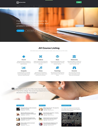

OVERVIEW
As the world become flater and more developed, education is no longer play a simple role of knowledge source for human being but becoming a real kind of service. People have a right to study in a most suitable environment and they definitely do it. To help institutes/ universities/ colleges/ vocational schools and other kinds of educational institution have a professional and effective way to approach target students, we - ExportHelp want to introduceJA University - a SEO friendly website template with fullyresponsive, which helps the company website display on any devices: computer, smartphone, tablet ..., it means that, your company will easily reach more customers if this technology is applied. Moreover, Education themed template which every institution will appreciate for its simplicity, clean design and professionalism.
DETAILED DESCRIPTION
There are two versions of JA University for you to choose, including:
 JA University built upon JA's robust JAT3 2 Framework, it's responsive and fits all the web enabled devices and mobile browsers, and
JA University T3 which is built on the powerful T3 Framework and supporting RTL language layout with all the amazing features come along with it such as: ThemeMagic, Layout Configurations, Bootstrap
 I. Fully responsive template

Joomla template for university and educational institution is 100% responsive, enables anyone to view your Joomla site not just beautifully on the extra wide screen but also equally stunning on tablets and mobile devices.
Responsive at a high level: Recognize whether the devices accessing is computer, tablet, or smartphone and automatically adjust the appropriate interface.
Automatically determines the resolution: Helps images and information display on mobile devices will not be distorted and keeps the access speed stable.
Friendly with search engines: A website with responsive technology will be identified easily and quickly by search engines and increase traffic.
II. 4 Menu styles

If you do not like the default Megamenu style, you can always go with Split, dropline or CSS menu style.
III. 8 Themes supported by default

Choose up to 8 color schemes for your JA University: Blue, Brown, Green, Grey, Iron, Purple, Teal and Violet.
IV. 4 Bonus pages

The site will not complete without these 4 gorgeous bonus pages. These goodies are packed in for free!
V. Specific style for K2 Blog

Get bored of the default Joomla content? You got K2 Component as your back.
VI. Inbuilt Google Fonts configuration

We love Google Fonts and the huge collection it holds. JA University is not an exception. You can easily configure any Google Fonts that you like, JA University supports them all.
VII. Inbuilt CSS and Javascript compression

Built in with CSS & Javascript at core, maximize your JA University performance. Make it fast, make it blast!
ADDITIONAL EXTENSIONS
You may refer to these additional extensions in order to upgrade your website and equip it with the most updated tools and technologies


If you would like to build SEO friendly websites with world class standards and most updated technologies- Fully Responsive- as well as enjoy one-stop service offered for you websites, please do not hesitate to contact us for more information and professional advice.
Besides, you may refer to our other services: website management and development, SEO-Google Adwords consulting, CRM Application to Business, Google Apps, Email marketing-Newsletter campaign, Domain and Hosting Registration.
We are truly your website master!
CONTACT US
Viet Nam office: 151 Dao Duy Anh Street, Phu Nhuan District, Ho Chi Minh City
Singapore office: 316 Tanglin Road, Block 316, Singapore
Hot line: (+84) 0938.53.15.88/ (+65) 83551210
Email: This email address is being protected from spambots. You need JavaScript enabled to view it.
Website: exporthelp.vn/en
Published in
Thư viện template en
-
About us
-
Services
-
Template store
-
Extension Store
-
Sharing Corner
-
FAQS
-
Contact